Theme
MetaFox theme is based on Material UI (opens in a new tab), a beautiful design and features with a suite of customization options that make it easy to implement your own custom design system.
MetaFox theme defines styles and layouts, in which styles indicate color palette, typography
Create A New Theme
Install dependencies
Open terminal and navigate to frontend project root folder. Then run the command
yarn && yarn bootstrapUsing metafox-cli tool to create a new theme and install to frontend workbox.
npx metafox-cliExample to create new theme chocolate and associate package @foxtheme/chocolate.
✔ What do you need? · Create new app
✔ What is vendor/company name? · foxdev
✔ What is theme id? · chocolate
Generating theme files ...
Updating workspace ...
Reloading workspace ...
Generated theme chocolate located at ./packages/foxdev/theme-chocolate
Restart frontend terminal to apply changes.
Now, you can see that the new theme files are generated under packages/foxdev/theme-chocolate folder
Restart frontend terminal then refresh the browser to see changes.
Customize Styling
Styling is defined in packages/foxdev/theme-chocolate/src/styles.json, includes
- palette - used to modify colors
- typography - used to modify CSS font properties
- shape - used to modify border radius system
Palette
palette.primary
{
  "primary": {
    "main": "#2682d5",
    "light": "#4a97dc",
    "dark": "#0a71cd"
  }
}
Used to represent primary interface elements for a user. Modifying palette primary will affect to submit buttons, continue buttons, upload file button, links, selected menu items.
palette.error
Used to represent interface elements that the user should be made aware of. Modifying palette error will affect to error messages
palette.warning
Used to represent potentially dangerous actions or important messages.
palette.success
Used to indicate the successful completion of an action that user triggered.
palette.border
- palette.border - border color of components
- palette.divider - used to present color of divider component.
palette.background
{
  background: {
    default: "#ededed",
    paper: "#fff",
    auto: "transparent",
  },
}
background.default Used to present background of your site & paper.
Typography
Typography indicates CSS font properties.
Typography supported variant h1, h2, h3, h4, h5, h6, subtitle1, subtitle2, body1, body2, button, caption, overline.
The following code styling for typography h1.
{
  "h1": {
    "fontWeight": 700,
    "fontSize": "40px",
    "lineHeight": 1.2,
    "letterSpacing": "0"
  }
}
Shape
Shape indicates border radius base for styling system.
{
  "shape": {
    "borderRadius": 0
  }
}
LayoutSlot
Layout slots define sizes for layout slot.
{
  "layoutSlot": {
    "background": {
      "paper": "#f5f5f5"
    },
    "points": {
      "xs1": 306,
      "xs2": 322,
      "xs3": 400,
      "xs": 400,
      "sm1": 600,
      "sm": 720,
      "md": 1024,
      "lg": 1200,
      "xl": 1920
    }
  }
}
Custom Components
MetaFox theme system allows to overrides Material components by processors.
Components.ts
In order to customize themed components (opens in a new tab). Edit the src/processors/Component.ts file
The following example explain how to customize button styles (opens in a new tab)
import { Theme, ThemedProps } from "@mui/material";

export default function overridesComponents(theme: Theme): void {
  theme.components.MuiButton = {
    defaultProps: {
      variant: "contained",
    },
    styleOverrides: {
      root: {
        borderRadius: 4,
        textTransform: "none",
        boxShadow: "none",
      },
    },
  };
  // other components
}
CssBaseLine.ts
In order to overrides css baseline (opens in a new tab), edit the processors/CssBaseLine.ts file
import { Theme } from "@mui/material";

export default function overridesGlobalStyles(theme: Theme) {
  if (!theme.components) {
    theme.components = {};
  }

  theme.components.MuiCssBaseline = {
    styleOverrides: {
      html: {
        WebkitFontSmoothing: "auto",
        fontSize: "16px",
      },
      body: {
        fontFamily: theme.fontFamily,
        overflowX: "hidden",
      },
      a: {
        color: theme.palette.primary.main,
      },
    },
  };
}
Custom Site Blocks
Site blocks allow to add blocks to any templates, on certain screen size and slot name in layout. You can put blocks to all templates
in the layout.siteBlocks.origin.json file as below
{
  [screenSize]: [
    {
      "blockId": [global unique id],
      "component": [componentName],
      "slotName": [slotName],
      "blockOrigin": "site",
      "blockLayout": "none"
    }
  ]
}
Example
{
  "small": [
    {
      "blockId": "appbar0",
      "component": "core.siteBarMobileBlock",
      "slotName": "header",
      "blockOrigin": "site",
      "blockLayout": "none"
    }
  ],
  "large": [
    {
      "blockOrder": -1,
      "component": "core.block.appbar",
      "slotName": "header",
      "blockId": "appbar0",
      "blockOrigin": "site",
      "blockLayout": "none"
    }
  ]
}
Theme Backend
In order to allow site administrator control theme, MetaFox theme system requires a Backend PHP package associated with the theme.
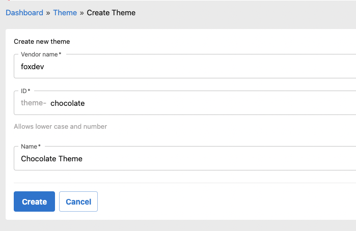
Go to AdminCP, access /admincp/layout/theme/create
Export Theme
Follow Export MetaFox package to export theme.
Custom Styles
Define
// TruncateText.tsx
export interface TruncateTextProps extends TypographyProps {
  component?: React.ElementType;
  lines?: 0 | 1 | 2 | 3 | 4 | 5;
  fontWeight?: number;
  fixHeight?: boolean;
  showFull?: boolean;
  isIE?: boolean;
}

const TruncateText = styled(Box, {
  name: "MuiTruncateText",
  slot: "Root",
  shouldForwardProp(prop: string) {
    return prop !== "lines" && prop !== "fixHeight" && prop !== "showFull";
  },
})<TruncateTextProps>(({ theme }) => ({
  display: "block",
  maxWidth: "100%",
}));

export default TruncateText;
Typings
import {
  ComponentsOverrides,
  ComponentsProps,
  ComponentsVariants,
} from "@mui/material/styles";
import "@mui/material/styles/components";

declare module "@mui/material/styles/components" {
  interface Components {
    MuiTruncateText?: {
      defaultProps?: ComponentsProps["MuiTruncateText"];
    };
    MuiItemView?: {
      defaultProps?: ComponentsProps["MuiItemView"];
      styleOverrides?: ComponentsOverrides["MuiItemView"];
      variants?: ComponentsVariants["MuiItemView"];
    };
  }
}